The quest
for the lost sign
Franco Maria Ricci
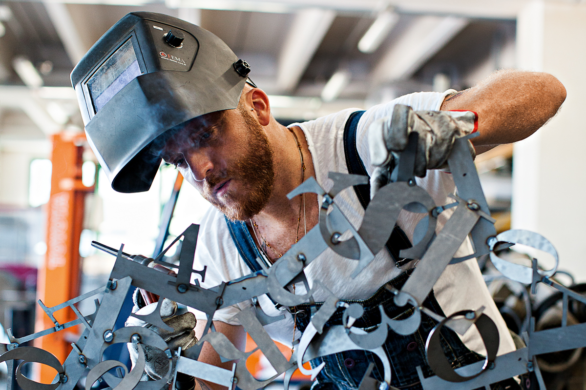
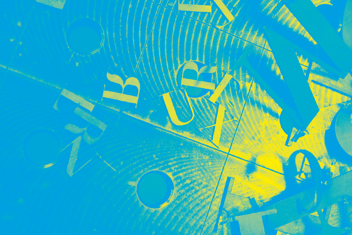
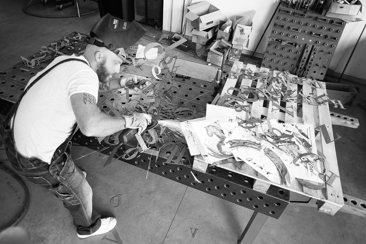
It is the destiny of alphabetical signs to lose their nature and individuality in order to give shape to words and texts; not unlike when atoms, in chemistry, assemble to give shape to a variety of molecules. However, there is a field where typographical characters preserve their nature as they turn from (something else’s) signifier into (their own) signified. In the vast and multi-faceted genre of the Still Life, the elements represented are mostly naturalistic or drawn from everyday life. Sometimes, however, they can also include elements drawn from one or more alphabets. In several important Pop Art works – I am thinking in particular of Robert Indiana – enlarged and brightly coloured typographical characters become the main subject of the piece.This connection with typographical signs is now preserved in Enrico Benetta’s metal artworks, inspired by Bodoni’s font. Through a collage-like technique, they produce sophisticated effects of impressive lightness, despite the material that composes them. It was only appropriate, I think, to chose Bodoni’s highest sanctuary – the Biblioteca Palatina in Parma – to stage Benetta’s graphic musings, which celebrate in their own way the fascinating world of that great typeface designer.
Testo critico pubblicato in: Franco Maria Ricci, Franco De Pasquale, Isabella de Stefano (a cura di), Enrico Benetta. Una questione di Carattere, catalogo della mostra, Parma, Fondazione Museo Bodoniano, 2012, Parma 2012.
